

Brochure Design for Nomad Arts
THE BRIEF
Case Study: Brochure Design for Nomad Arts
Overview: Nomad Arts is an organization that champions the concept of anonymous art, providing a platform for artists to express themselves without revealing their identities. For their exclusive quarterly event, “Nomadic Art Series II,” held at the Dorsett Hotel, they required a brochure that would capture the spirit of anonymity and artistic freedom while providing key information to a select audience.
Client Requirement: Nomad Arts sought a brochure that would serve both as an informative guide and a visual representation of their unique event. The design needed to align with the mysterious and exclusive nature of the “Nomadic Art Series II,” enticing attendees while respecting the theme of anonymity. The brochure also needed to reflect the elegance of the Dorsett Hotel setting and appeal to a discerning audience.
Scope/Skills/Service:
- Scope: Brochure Concept and Design, Visual Identity Enhancement, Print Preparation
- Skills: Graphic Design, Typography, Layout Design, Conceptual Art Direction, Print Production
- Service: Design Ideation, Layout Structuring, Visual Storytelling, Coordination with Print Vendors
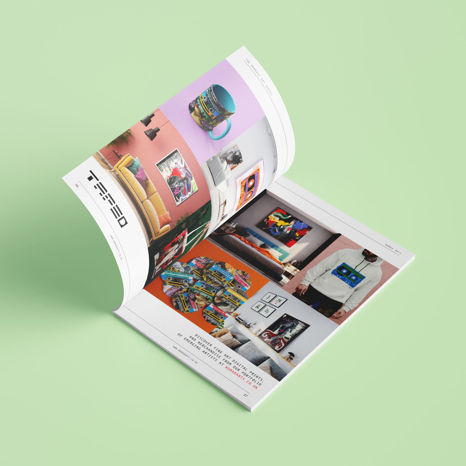
Solution: To create a brochure that conveyed both the mystery and sophistication of the “Nomadic Art Series II,” I focused on an abstract design language that resonated with the concept of anonymity. The cover featured crops of the artists work evoking the idea of mystery and anonymity. The stripped back colour palette allowed the focus to be toward the vibrant artwork.
The interior layout was kept clean and minimalistic, balancing negative space with strategically placed text and images to guide the reader through the event details without overwhelming them. Each section was carefully crafted to maintain an air of mystery, using partial images, and abstract forms that hinted at the artists’ works without revealing them completely. The typography was modern yet elegant, providing a clear, easy-to-read structure that complemented the visual aesthetic.
Challenges: The main challenge was maintaining the theme of anonymity while ensuring the brochure was still informative and engaging. It was important to find a design solution that honoured the mysterious nature of the artwork while providing sufficient details about the event itself. Additionally, the design needed to be refined enough to reflect the high-end setting of the Dorsett Hotel and appeal to a sophisticated audience.
Result: The brochure effectively communicated the essence of the “Nomadic Art Series II,” capturing the attention and curiosity of the invite-only audience. The design was lauded for its ability to balance elegance with mystery, enhancing the overall experience of the event. Feedback from attendees was overwhelmingly positive, with many remarking that the brochure added an extra layer of exclusivity and intrigue to the evening. The client was pleased with how the design aligned with their vision, reinforcing their brand identity and the unique concept of anonymous art.


