
Apprentiva
THE BRIEF
Overview: Apprentiva is a company dedicated to helping individuals secure apprenticeships across various industries. They provide resources, support, and guidance to aspiring professionals, empowering them to take their first steps toward a successful career. To enhance their visibility and appeal, Apprentiva required a new brand identity that would align with their mission and engage their target audience effectively.
Client Requirement: Apprentiva needed a comprehensive brand overhaul, including a logo, colour palette, and visual assets that would convey trust and professionalism while remaining approachable to a younger audience. The project also involved designing an e-book, custom illustrations, and print collateral like business cards to create a cohesive brand experience across both digital and physical mediums.
Scope/Skills/Service:
- Scope: Brand Identity Design, Logo Creation, E-book Design, Custom Illustrations, Print Collateral (Business Cards, Flyers)
- Skills: Graphic Design, Illustration, Typography, Digital and Print Design, Art Direction
- Service: Concept Development, Visual Storytelling, Brand Strategy, Client Collaboration
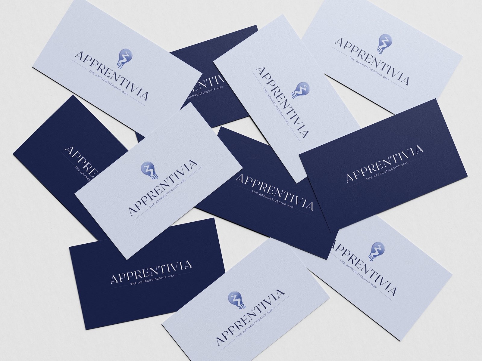
Solution: The new brand identity for Apprentiva centered around a modern logo that featured a lightbulb with a pathway inside it, symbolizing the journey and enlightenment that come with finding the right apprenticeship. The lightbulb represents new ideas and opportunities, while the pathway inside signifies personal growth and the journey toward a career.
A blue-purple color palette was chosen to communicate trust, reliability, and professionalism, balanced with a contemporary feel to appeal to a younger demographic. Custom illustrations were created to align with this new identity, adding an engaging and approachable element to the brand’s visual language.
For the e-book, I developed a user-friendly layout with clear sections, enriched with illustrations that guide readers through the apprenticeship process. This design aimed to be both informative and visually engaging, making the content more accessible to the audience.
Additionally, I designed business cards and other print collateral to ensure consistency across all brand touchpoints, reinforcing Apprentiva’s message and creating a unified brand experience.
Challenges: The primary challenge was creating a brand identity that felt both youthful and professional, resonating with both young job seekers and industry partners. Balancing the dynamic colour palette while maintaining a sense of trust and authority was key. The logo design also required careful consideration to visually represent the concept of growth and guidance without being overly complex.
Result: The new branding successfully positioned Apprentiva as a trusted and innovative leader in the apprenticeship space. The logo, with its symbolic pathway in a lightbulb, became a strong visual representation of their mission. The e-book and illustrations effectively engaged their target audience, leading to increased downloads and user interaction. Print collateral, including business cards, helped to create a cohesive and memorable brand presence at events and meetings. Overall, the rebranding resulted in enhanced visibility, improved client engagement, and strengthened Apprentiva’s market position.


